_edited.png)
The Psychology Behind High-Converting Landing Pages
- Emily Neuhoff
- Jul 19
- 3 min read

Your landing page has 3 seconds to make an impression. In those crucial moments, visitors decide whether to stay or leave based on psychological triggers that operate below conscious awareness. Understanding these mental shortcuts can transform your conversion rates.
The Scarcity Principle in Action
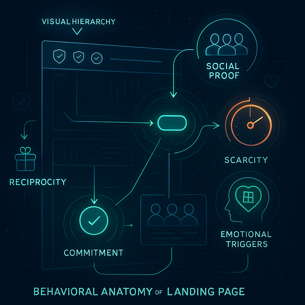
Scarcity creates urgency. When visitors perceive limited availability, their fear of missing out (FOMO) activates. This isn't manipulation—it's how our brains evolved to make quick decisions about valuable resources.
Implementation:
"Only 5 spots remaining"
Countdown timers for offers
Limited-time bonuses
Cognitive Load: Less is More
The human brain can only process 7±2 pieces of information simultaneously. Overwhelming visitors with choices creates decision paralysis. High-converting pages reduce cognitive load through:
Single, clear call-to-action
Minimal navigation options
Progressive disclosure of information
Social Proof: The Herd Mentality
We look to others' behavior to guide our decisions, especially in uncertain situations. This psychological phenomenon, called social proof, is your conversion secret weapon.
Effective social proof elements:
Customer testimonials with photos
User count ("Join 50,000+ users")
Industry recognition badges
Real-time activity notifications
The Anchoring Effect
The first piece of information visitors encounter sets their reference point for all subsequent judgments. Smart marketers use anchoring to frame value perception.
Example: Showing a higher-priced option first makes your main offer seem more reasonable by comparison.
Visual Hierarchy and Eye Tracking
Eye-tracking studies reveal predictable scanning patterns. The "F-pattern" shows users scan horizontally at the top, then vertically down the left side. Design your page to match natural reading behavior:
Headlines grab attention first
Subheadings guide the eye downward
CTAs placed where eyes naturally pause
Loss Aversion: Fear Motivates Action
People fear losing something twice as much as they value gaining it. Frame your offer around what visitors stand to lose rather than just what they'll gain.
Instead of: "Get 20% more leads" Try: "Don't miss out on 20% more leads"
The Peak-End Rule
Visitors remember two key moments: the peak emotional experience and how they felt at the end. Ensure your landing page creates a positive peak moment and ends with confidence-building elements like guarantees or testimonials.
Trust Signals: Reducing Perceived Risk
Online transactions require trust. Incorporate trust signals to reduce perceived risk:
Security badges
Money-back guarantees
Professional design quality
Clear contact information
The Power of Color Psychology
Colors trigger emotional responses:
Red: urgency, excitement
Blue: trust, reliability
Green: growth, action
Orange: enthusiasm, creativity
Match your color choices to your desired emotional response.
Practical Implementation
Test these psychological triggers:
A/B test scarcity messaging
Reduce form fields to minimize cognitive load
Add customer logos for social proof
Use power words that trigger emotion
Position your CTA where eyes naturally focus
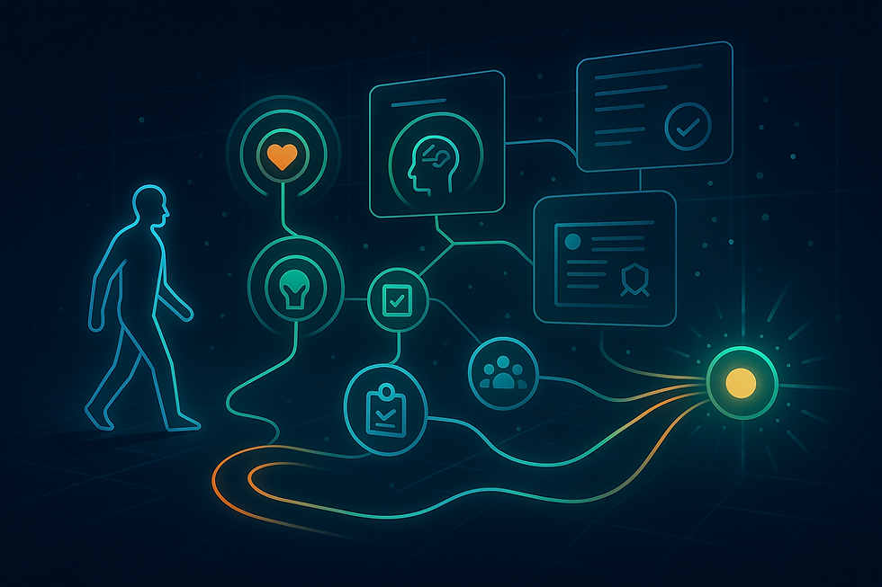
The Bottom Line
High-converting landing pages don't just look good—they understand human psychology. By aligning your design with how the brain naturally processes information and makes decisions, you create pages that feel intuitive and compelling.
Remember: psychology explains the "why" behind visitor behavior. Use these insights ethically to create genuinely helpful experiences that guide users toward decisions that benefit them.
What psychological triggers have you found most effective in your landing pages? Share your experiences in the comments below.

Comments